Website Design with 960 Grid System
In this article, we will discuss the website design with 960 Grid System; 960GS. This is also a Grid Framework to simplify the web design with the help of grids.

In this article, we will discuss the website design with 960 Grid System; 960GS. This is also a Grid Framework to simplify the web design with the help of grids.
Introduction
This grid system works with 960px with by default. Why? So according to them (no doubt I also agree):
All modern monitors support at least 1024 × 768 pixel resolution. 960 is divisible by 2, 3, 4, 5, 6, 8, 10, 12, 15, 16, 20, 24, 30, 32, 40, 48, 60, 64, 80, 96, 120, 160, 192, 240, 320 and 480. This makes it a highly flexible base number to work with.
So to start with this let me have a brief intro to the class semantics of 960 Grid System. Then we will see the site design with 960GS.
By default the 960GS comes with 12 columns and 16 columns. Here divs are used with appropriate classes. So to decide how many columns config will you work with and move ahead with that. Suppose we are choosing 12 columns; so will have a container div with class container_12 and if it is 24 columns then the class will be container_24.
Now if you want to have a grid that covers 3 columns then the div’s class will be grid_3. So in general suppose you want to cover ## columns; the class will be grid_##
Now you wanna create a grid which is with margin of some columns on left; suppose 3 columns; the it will also have a class of prefix_3. So in general suppose you want the div to have ## columns’ width margin on left; the div will also have the prefix_## class.
Similarly if the right margin of 3 columns has to be added then the class will be suffix_3; and the generally it will be suffix_##.
For prefix and suffix ## will range from 1 to (columns-1). For grids; the ## will be from 1 to (columns).
Some of the helpers are:
- To remove left margin use
alpha - To remove right margin use
omega - To pull a grid # columns on left side; use the class pull_#; # being the no. of columns till you wanna pull the grid; ranging from 1 to (columns – 1)
- To pull a grid # columns on right side; use the class push_#; # being the no. of columns till you wanna pull the grid; ranging from 1 to (columns – 1)
- To clear the floats use
clearclass
Site Design
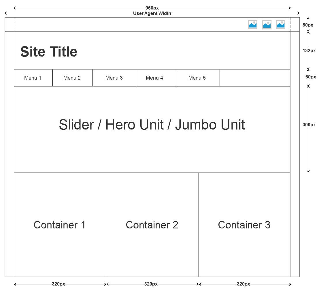
Now we will start with the site design. For the site design we will use the same wire-frame that we have used for the site design with Bootstrap.

So with this layout; for top bar we will create a full width div with a container div of width 960px. And inside that we will put our social icons. For social icons; here also; we will use the Font-awesome. Following will be the HTML for that:
<div id="top_bar">
  <div class="container_12">
    <ul>
      <li><a href="#"><i class="fa fa-facebook"></i></a></li>
      <li><a href="#"><i class="fa fa-twitter"></i></a></li>
      <li><a href="#"><i class="fa fa-linkedin"></i></a></li>
      <li><a href="#"><i class="fa fa-google-plus"></i></a></li>
      <li><a href="#"><i class="fa fa-rss"></i></a></li>
    </ul>
  </div>
</div>
Now the site header. That’s also clear straight forward; we will create a header element. Under that we will create a child container div with class container_12 and then style it according to our needs to properly demonstrate the site header. Following is the HTML for the site title:
<div class="container_12">
  <header>
    <h1>Site Title</h1>
  </header>
</div>
And the menu bar; for that we will create a nav element which will have the following HTML:
<div class="container_12">
  <nav>
    <ul>
      <li><a href="#">Home</a></li>
      <li><a href="#">Products</a></li>
      <li><a href="#">Services</a></li>
      <li><a href="#">Clients</a></li>
      <li><a href="#">About Us</a></li>
      <li><a href="#">Contact Us</a></li>
    </ul>
  </nav>
</div>
Now the jumbotron unit; alike Bootstrap; we will have to design the jumbotron by ourself. Any slider/carousal can also be added over here. Before that; now our whole page will go in 960px; so will create a div.conatiner_12 and all the rest of the page will nested under this. I am nesting the jumbotron in the following way:
<div class="container_12">
  <section>
    <div class="jumbotron">
      <p>Jumbotron</p>
    </div>
  </section>
</div>
Now the three column container. AS we have chosen the 12 column layout; our there columns can be created by four columns of the 960GS. So each of our div will have class grid_4. But to make it look better we will remove the left margin of first column by alpha and right margin of last column by omega. Here is the HTML for that:
<div class="container_12">
  <section>
    <div class="columns clearfix">
      <div class="grid_4 ">
        <h2>Products</h2>
        <p>Lorem ipsum dolor sit amet, consectetur adipisicing elit</p>
        <a class="button" href="#">Know More</a>
      </div>
      <div class="grid_4 ">
        <h2>Services</h2>
        <p>Lorem ipsum dolor sit amet, consectetur adipisicing elit</p>
        <a class="button" href="#">Know More</a>
      </div>
      <div class="grid_4 ">
        <h2>Support</h2>
        <p>Lorem ipsum dolor sit amet, consectetur adipisicing elit</p>
        <a class="button" href="#">Know More</a>
      </div>
    </div>
  </section>
</div>
And yes; the footer:
<div class="container_12">
<footer>
<div>
<p>©2014</p>
</div>
</footer>
</div>
Last but not the least; the style used for above elements:
body{ font-family: 'PT Sans', 'Myriad Pro', Verdana; }
  h1{ font-size: 4em; }
  h2{ font-size: 3.25em; }
  h3{ font-size: 2.75em; }
  h4{ font-size: 2.25em; }
  h5{ font-size: 1.75em; }
  #top_bar{
    border-bottom: 1px solid #ccc ;
    line-height: 48px;
  }
  #top_bar ul{
    display: inline-block;
    list-style: none;
    vertical-align: middle;
    float: right;
  }
  #top_bar ul li{
    display: inline-block;
    float: left;
    padding:0 10px;
  }
  #top_bar a{
    text-decoration: none;
    color: inherit;
    font-size: 24px;
  }
  #top_bar a:hover{ color: #ccc; }
  header h1{
    font-weight: normal;
    line-height: 130px;
  }
  nav{
    border-top: 1px solid #ccc;
    border-bottom: 1px solid #ccc;
    font-size: 20px;
  }
  nav ul{
    display: inline-block;
    list-style: none;
    vertical-align: middle;
  }
  nav ul li{
    display: inline-block;
    float: left;
    padding:10px 14px;
  }
  nav a{
    text-decoration: none;
    color: inherit;
  }
  nav ul li:hover{ background-color: #eee; }
  nav a:hover{ color: #555; }

  .jumbotron{
    background-color: #eee;
    background-image: url(img/bg3.jpg);
    height:300px;
    border-bottom: 1px solid #ccc;
  }
  .jumbotron p{
    text-align: center;
    font-size: 3.5em;
    color: #999;
    line-height: 300px;
  }
  .columns{
    margin-top: 20px;
    margin-bottom: 20px;
    text-align: center;
  }
  .columns h2{ font-weight: normal; }
  .columns p{ padding:30px; }

  a.button{
    border:1px solid #999;
    padding:8px 12px;
    border-radius: 3px;
    margin:5px 0px;
    display: inline-block;
    text-decoration: none;
  }
  a.button:hover{ background-color: #eee; }
  footer div{ border-top: 1px solid #ccc; }
  footer p{
    text-align: center;
    line-height: 40px;
  }
Extras
The 960GS also comes with the 24 columns config in which the each column has margin of 5px.
The 960GS is not just limited to 960px. You can also get the larger width Grid System and the 12/16 columns accordingly. And with adapt.js you can configure which css has to be loaded. More info and example on http://adapt.960.gs/.
| File Name | Screen Width |
|---|---|
| mobile.css | below 760px |
| 720.css | 760px to 980px |
| 960.css | 980px to 1280px |
| 1200.css | 1280px to 1600px |
| 1560.css | 1600 to 1940px |
| 1920.css | 1940px to 2540px |
| 2520.css | above 2540px |
Moreover the 960GS also provides a handy reset.css file. Include it you don't wanna code your own reset.
Summary
Finally this single page is ready. But as a defect this design is not responsive and If you don’t need the responsiveness for the site; go for it.

