Triangles and Arrow Heads with CSS
Triangles and Arrows heads are simple construct of UI though hard to make with simplicity. This article shows how to make Triangles and Arrow Heads with CSS

Arrows for tooltips, Triangles are possible with CSS3 also. No need to go with the image approach all the time. In some cases, it would be wise to use the images for arrowheads.
Here is this article; we will be discussing a simple guide to creating Triangles and Arrow Heads with CSS.
So to create the triangles and arrowheads with CSS3, I need to discuss some terms (properties) related to CSS3. They are:
- Pseudo Elements
- Borders
Solution
The borders have the hack to create these arrows. When borders are given more width, these are rendered as having an edge where two borders meet, i.e. point where border-left and border-top intersect; the top-left corner will have an edge.
To see it practically for an element, set the border as 10px solid red border-top and 10px solid green for border-left. Then you can see the edge correctly.
Consider a case when the element is of only zero or one pixel. Then it would look something like this:
<style type="text/css">
.triangles {
  border:30px solid transparent;
  border-top-color: red;
  border-right-color: blue;
  border-bottom-color: green;
  border-left-color: black;
  display: block;
  width: 0px;
  height: 0px;
}
</style>
<div class="triangles"></div>
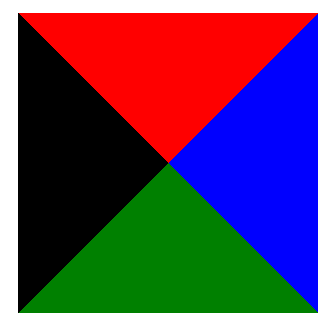
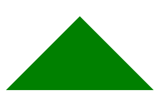
As you can see, each side looks like a triangle; hence, this way, triangles and arrowheads can be created. Suppose we want to create an arrowhead pointing in an up direction; then, we can use the green section of the above image. And remaining should not be visible. To do that, we will have to follow these steps:
- Make the opposite side border as
0px. As we want theborder-bottom; we will set theborder-topas0px. - Make the adjacent sides invisible. This can be done by setting the
colorastransparent. So here we will set theborder-left-colorandborder-right-colorastransparent. - Now include this div as an additional element, giving it the look of an arrowhead.
You can see the above steps in the following example:
<style type="text/css">
.arrow-head {
  border: 30px solid transparent;
  border-top: 0;
  border-right-color: transparent;
  border-bottom-color: green;
  border-left-color: transparent;
  display: block;
  width: 0px;
  height: 0px;
}
</style>
<div class="arrow-head"></div>
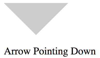
So Similarly, you can create an arrowhead of grey colour (#ccc) with the following code:
<style type="text/css">
  .arrow{
    display: block;
    width: 0px;
    height: 0px;
    border:30px solid transparent;
  }
  .arrow.arrow-up{
    border-bottom-color: #ccc;
    border-top-width: 0px;
  }
  .arrow.arrow-down{
    border-top-color: #ccc;
    border-bottom-width: 0px;
  }
  .arrow.arrow-left{
    border-right-color: #ccc;
    border-left-width: 0px;
  }
  .arrow.arrow-right{
    border-left-color: #ccc;
    border-right-width: 0px;
  }
</style>
<div class="arrow arrow-up"></div>
<div class="arrow arrow-down"></div>
<div class="arrow arrow-left"></div>
<div class="arrow arrow-right"></div>
And it will look like this:
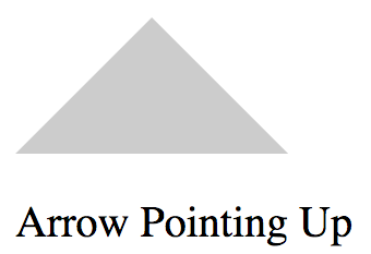
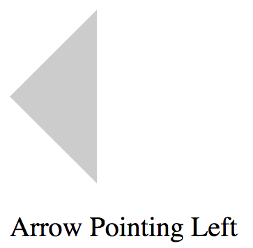
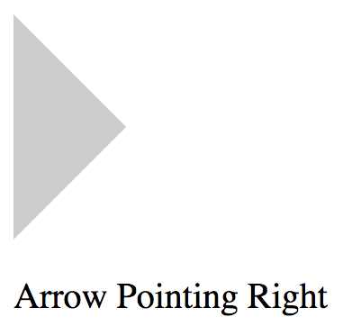
Now let's come to an advanced topic; Utilising Pseudo elements for arrowheads. To use the Pseudo elements; you will need to have a container element, and inside that, you can have your content and the arrowhead; where the arrowhead is positioned as absolute.
The following snippet can help you to see the use of a pseudo-element for the upper direction arrow:
.profile{
    display: inline-block;
    padding: 10px;
    border:1px solid #ccc;
    border-radius: 2px;
    margin-top: 15px;
    position: relative;
  }
  .profile .name{
    margin: 0px;
    display: block;
    padding-bottom: 5px;
    margin-bottom: 3px;
    border-bottom: 1px dotted #ccc;
  }
  .profile::before{
    content: '';
    display: block;
    width: 0;
    height: 0;
    border: 10px solid transparent;
    border-bottom-color: #ccc ;
    border-top: 0px;
    position: absolute;
    top: -10px;
  }
<div class="profile">
  <p class="name">Pankaj Patel</p>
  <small>
    <a href="http://github.com/pankajpatel">
      http://github.com/pankajpatel
    </a>
  </small>
</div>
And this will look like this:

So now you can play with this hack and make more interactive and beautiful UIs. Happy Coding!!!
This post is sponsored by PluralSight

Conclusion
Let me know through comments ? or on Twitter at @heypankaj_ and/or @time2hack
If you find this article helpful, please share it with others ?
Subscribe to the blog to receive new posts right in your inbox.

