CSSNext: TurboCharge your CSS Development ?
Now CSS has really cool enhancements; some are under consideration, some are already part of specs. Use those features worriless with CSSNext and PostCSS.


CSS has come really far and now has really cool enhancements; some are under consideration, some are already part of specs. Those enhancements will turbocharge your CSS development in terms of speed & experience. But still, they might not be available in Browser.
CSSNext with PostCSS comes to the rescue.
CSSNext is set of PostCSS plugins to enable CSS features for your development.
Here are top five quick features provided by CSSNext:
1. Variables
Variables are the easies way to make the consistent changes apart from single responsibility CSS files.
:root {
  --color-primary: #555;
  --color-shadow-primary: rgba(100, 100, 100, 0.3);
  --shadow-primary: 1px 1px 3px 1px var(--color-shadow-primary);
}
body {
  background: var(--color-primary);
}
.card {
  box-shadow: var(--shadow-primary);
}
2. Nested Rules
Nested rules are one of the primary reason people moved to LESS or SASS. With CSSNext, you can do so.
The only syntactical difference is the heavy use of & to mark the hierarchy properly. like as follows:
:root {
  --color-primary: #555;
  --color-shadow-primary: rgba(100, 100, 100, 0.3);
  --shadow-primary: 1px 1px 3px 1px var(--color-shadow-primary);
}
header {
  margin-bottom: 1em;
  & h1 {
    color: var(--color-primary);
  }
  &.with-shadow {
    box-shadow: var(--shadow-primary);
  }
}
which will have output like:
header {
  margin-bottom: 1em
}
header h1 {
  color: #555;
}
header.with-shadow {
  -webkit-box-shadow: 1px 1px 3px 1px rgba(100, 100, 100, .3);
          box-shadow: 1px 1px 3px 1px rgba(100, 100, 100, .3);
}
But the feature does not end here. With CSSNext, we have @nest.
With @nest, you can do complex nesting where you can point selector in certain parent; i.e. context aware rules. Pretty cool ?; right! Here is an example:
:root {
  --color-primary: #555;
  --color-shadow-primary: rgba(100, 100, 100, 0.3);
}
.button, button {
  color: #fff;
  background: #aaa;
  border-radius: 0.25em;
  border: 1px solid var(--color-primary);
  box-shadow: 1px 1px 2px 1px var(--color-shadow-primary);

  /* this section will be applied to the (.button, button) inside (.nav.dark) */
  @nest .nav.dark & {
    /* & = .button, button */
    border-color: #efefef;
    color: var(--color-primary);
    background: #dedede;
    box-shadow: 1px 1px 2px 1px rgba(255, 255, 255, 0.2);
  }
}
generates following:
.button, button {
  color: #fff;
  background: #aaa;
  border-radius: 0.25em;
  border: 1px solid #555;
  -webkit-box-shadow: 1px 1px 2px 1px rgba(100, 100, 100, .3);
          box-shadow: 1px 1px 2px 1px rgba(100, 100, 100, .3)
}
.nav.dark .button, .nav.dark button {
  border-color: #efefef;
  color: #555;
  background: #dedede;
  -webkit-box-shadow: 1px 1px 2px 1px rgba(255, 255, 255, .2);
          box-shadow: 1px 1px 2px 1px rgba(255, 255, 255, .2);
}
You can read more about the specification here: https://tabatkins.github.io/specs/css-nesting/#at-nest
3. Colors (or Colours ?) related Utilities
Managing colors is also a big hassle in a project. Generally you would have color code for every definition. Though with advanced color manipulation, you can limit the color code definition to minimal so that you don't have to change a lot (and remember every place you wrote that color code).
For colors, there are many helping function provided by CSSNext. Let's take a look at them with example:
3.1 color()
This function will let you convert the colors at ease. The converted colors are transpiled to rgba. Of course you will need the modifier function to change the color. Let's take a look at the example:
:root {
  --color-primary: #333;
}
a {
  color: var(--color-primary);
  &:hover {
    /* Lighten the color by 20% */
    color: color(var(--color-primary) tint(20%));
  }
  &:active {
    /* Darken the color by 20% */
    color: color(var(--color-primary) shade(20%));
  }
}
3.2 gray()
This will allow you to use the gray shades very easily; with and without alpha/transparency. For example:
:root {
  --color-primary: #333;
  --gray-1: gray(10%); /* rgb(26, 26, 26) */
  --gray-2: gray(50); /* rgb(50, 50, 50) */
  --gray-3: gray(50%, 50%); /* rgba(127, 127, 127, 0.5) */
  --gray-4: gray(200, 80%); /* rgba(200, 200, 200, 0.8) */
}
3.3 #rrggbbaa
You can quickly write alpha colors with conventional # as well. It goes well with #rgba as well. The alpha For example:
:root {
  --color-primary: #333;
  --gray-1: gray(10%); /* rgb(26, 26, 26) */
  --gray-2: gray(50); /* rgb(50, 50, 50) */
  --gray-3: gray(50%, 50%); /* rgba(127, 127, 127, 0.5) */
  --gray-4: gray(200, 80%); /* rgba(200, 200, 200, 0.8) */
}
3.4 hwb()
HWB (Hue, Whiteness, Blackness) is another way to define colors. HWB is similar to HSL (Hue, Saturation, Lightness) but more readable.
Many color pickers allow you to pick color in form of HSL curve.
You can define Hue in terms of Integer from 0 to 360 or degrees from 0 to 360.
The usage will look like as follows; and it will transpile to rgba
:root {
  --color-link: hwb(190, 35%, 20%); /* rgb(89, 185, 204) */
  --color-text: hwb(90, 50%, 60%, 0.8); /* rgb(116, 116, 116, 0.8) */
}
4. Custom Selectors and Media Queries
Custom selectors and media queries will make your CSS development flow a lot faster. How? Let's see that
4.1 Custom Selectors
You can define a custom selector and reuse it in the whole file as if you are using a variable. Obviously, the way to use them is a bit different in terms of syntax but they bring a lot on table for that learning cost. For example we have web component for button named app-button, custom selector will make it easy to keep those app specific things centralised
@custom-selector :--button app-button, .button;
@custom-selector :--enter :hover, :focus;

:--button {
  border: 1px solid #ccc;
  border-radius: 0.3rem;
  color: #555;
  transition: all ease 200ms;
}
:--button:--enter {
  border: 1px solid #555;
  background: #aaa;
  color: #fff;
}
4.2 Custom Media Queries
Media Queries are pretty hard to manage when their scope is project wide. Custom Media queries are great way to manage them at one place and have more meaningful names like mobile-only, tablet-up etc. Lets see an example:
@custom-media --tablet-down (max-width: 768px);

@media (--tablet-down) {
  body {
    font-size: 1.2rem;
  }
}
4.3 Media Query Ranges
Sometimes it is very confusing to arrange media queries in terms of max-width and min-width. Ideally, there should be as less breakpoints as possible, but sometimes, it is unavoidable. The overlap of those breakpoints is painful. The Media Query Ranges will help you make those ranges painfully. Lets see an example of breakpoints:
@custom-media --tablet-only (width >= 768px) and (width <= 1024px);

@media (--tablet-only) {
  body {
    font-size: 1rem;
  }
}
5. Image Sets
This polyfill is enabled by https://github.com/SuperOl3g/postcss-image-set-polyfill. It allows you to set different images for each kind of resolution of user device.
header {
  background-image: image-set(
                      url(img/header.png) 1x,
                      url(img/header-2x.png) 2x,
                      url(header-print.png) 600dpi
                    );
}
which will output as:
header {
  background-image: url(img/header.png);
}

@media (-webkit-min-device-pixel-ratio: 2), (min-resolution: 192dpi) {
  header {
    background-image: url(img/header-2x.png);
  }
}

@media (-webkit-min-device-pixel-ratio: 6.25), (min-resolution: 600dpi) {
  header {
    background-image: url(header-print.png);
  }
}
Conclusion
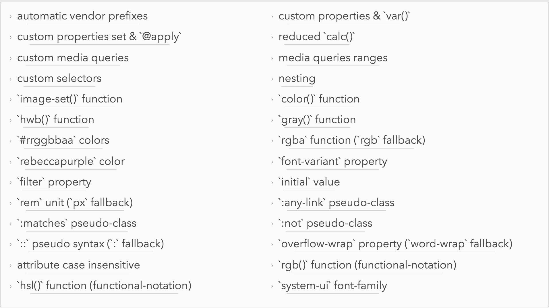
There are many more features which will help you in small scale or in specific use cases which you can find at https://cssnext.io/features/

Tell us about your experience with new CSS features.

