Building Fast Forms in React with HTML5 & Validations
While making WebApps, Forms are required all the time and always need some fine tuning. Let's see how to Build Fast Forms in React with HTML5 & Validations

If you are making a web app, you will need to create Forms most of the time. Forms are notorious for demand in Creativity and Customizability.
One of the ways we can ease the Form handling is by representing Forms in Data and Functions. And with this representation, we can create, read and update the Form elements.
This post is sponsored by LastPass
I have been using LastPass for more than 4 years and I couldn't be more happier with security it offers.

So to start with, let’s see a list of possible Form Elements that can take part in Form or Act on it:
- Text
- Date
- Time
- Password
- Number
- File
- Hidden
- Tel
- Checkbox
- Radio
- URL
- Range
- Search
- etc. (week, image, month, reset, submit, …)
Now let’s try to create a JS Object representation for one of these inputs, text:
const fields = [
  {
    type: "text", // input type
    name: "fullName", // Form input name
    label: "Full Name", // Label for Input
    placeholder: "John Doe" // Placeholder
  }
]
And Lets create this input type text in React:
// Input.js
import React from "react";

export function Input({ field }) {
  const id = `input-id-${+Date.now()}-${Math.random()}`
  return (
    <div className="form-field">
      <label htmlFor={id}>{field.label}</label>
      <input
        id={id}
        type={field.type}
        name={field.name}
        placeholder={field.placeholder}
      />
    </div>
  )
}
? But what about events? We need values from the Form!
Well, we will use FormData API to collect values from the Form.
? But we still need events to validate the Values!
We will use HTML5’s native form validation to prevent submit.
Though, if we need advanced validation. We can add the post processors to operate and change the values before sending them to the Server
const fields = [
  {
    type: 'text', // input type
    name: 'fullName', // Form input name
    label: 'Full Name', // Label for Input
    placeholder: 'John Doe', // Placeholder
    required: true
  }
]
And with above field definition we can create different Inputs. Though, for different text based inputs, we will have our Input component as the following:
// Input.js
import React, {useRef} from 'react'
import TextInputRenderer from './InputType/Text'

const getRenderer = (type) => {
  switch(type.toLowerCase()) {
    case 'tel':
    case 'url':
    case 'text':
    case 'date':
    case 'time':
    case 'file':
    case 'week':
    case 'month':
    case 'image':
    case 'email':
    case 'color':
    case 'range':
    case 'number':
    case 'search':
    case 'password':
      return TextInputRenderer
    default: return 'div'
  }
}

const Input = ({ field = {} }) => {
  const inputRef = useRef(null)
  const Component = getRenderer(field.type)

  return (
    <div className="form-field">
      <Component
        {...field}
        ref={inputRef}
        onChange={() => console.log(inputRef.current)}
      />
    </div>
  )
}

export default Input
// components/InputType/Text.js
import React, {Fragment} from 'react'

export default React.forwardRef((props, ref) => {
	const id = `input-id-${+Date.now()}-${Math.random()}`
	return (
    <Fragment>
      <label htmlFor={id}>{props.label}</label>
	    <input id={id} {...props} ref={ref} />
	  </Fragment>
	)
})
In above code, we have extracted the text-based input to components/InputType/Text.js. Input component will only take care of attaching the necessary refs and handlers.
Here, one thing to notice is React’s forwardRef, it takes a ref passed as a prop and forwards it to the child component.
Before moving forward, as we can see that we are using the unique ID generation logic. We can extract this logic to a separate utility function:
// src/utils/get-id.js
export default () => [
  'input',
  +Date.now(),
  Math.random()
].join('-')
In future, we can use a robust UUID with libraries like uuid
Now the inputs Radio, Select and Checkbox render in different Markup.
Checkbox
In general, for singular checkboxes, it renders like text inputs. Though a common use case can be on Checkbox List and this is where we need to change the rendering of the component
import React, {Fragment} from 'react'
import getId from '../../utils/get-id'

export default React.forwardRef((props, ref) => {
  const id = getId()
  return (
    <Fragment>
      <label htmlFor={id}>{props.label}</label>
      {props.options ? (
        <span className="flex-col">
          {props.options.map(item => {
            const id = getId()
            return (
              <span key={id}>
                <input id={id} {...props} value={item.value} />
                <label htmlFor={id}>{item.label}</label>
              </span>
            )
          })}
        </span>
      ) : <input id={id} {...props} ref={ref} />}
    </Fragment>
  )
})
Radio
For Radio Group, all inputs have the same name. And, Field Definition needs to accept the list of options to generate a Radio button list.
import React, {Fragment} from 'react'
import getId from '../../utils/get-id'

export default React.forwardRef(({options, label, ...props}, ref) => (
  <Fragment>
    <label>{label}</label>
    <span className="flex-col">
      {options.map(item => {
        const id = getId()
        return (
          <span key={id}>
            <input id={id} {...props} value={item.value} />
            <label htmlFor={id}>{item.label}</label>
          </span>
        )
      })}
    </span>
  </Fragment>
))
Select
Selects have options and differ in basic rendering. Hence we need to create a different component for Selects.
import React, {Fragment} from 'react'
import getId from '../../utils/get-id'

export default React.forwardRef(({options, ...props}, ref) => {
  const id = getId()
  return (
    <Fragment>
      <label htmlFor={id}>{props.label}</label>
      <select ref={ref} {...props}>
        {options.map(item => (
          <option key={item.value} value={item.value} selected={item.selected}>
            {item.label}
          </option>
        ))}
      </select>
    </Fragment>
  )
})
Now that our for is set up, we need to handle the validations in our form.
Validations for example:
requiredfieldminandmaxmaxLengthandminLengthpatternemailurl- etc.
For this, we need to go back to the Field Definitions. We need to add the needed attributes respective to the type of input & desired validations. Considering this, the following could be a combination:
export default [
  {
    type: 'text', // input type
    name: 'fullName', // Form input name
    label: 'Full Name', // Label for Input
    placeholder: 'John Doe', // Placeholder
    pattern: '[A-Za-z\\s]{1,}',
    required: true
  },
  {
    type: 'date', // input type
    name: 'dob', // Form input name
    label: 'Date of Birth', // Label for Input
    required: true
  },
  {
    type: 'number', // input type
    name: 'workCapacity', // Form input name
    label: 'Weekly Work Capacity', // Label for Input
    required: true,
    min: 10,
    max: 8*7, // 8 hrs per day for 7 days of week
    step: 4 // half day steps
  },
  {
    type: 'file', // input type
    name: 'profilePicture', // Form input name
    label: 'Profile Picture', // Label for Input
    required: true
  },
  {
    type: 'radio',
    name: 'gender',
    label: 'Gender',
    required: true,
    options: [
      {
        label: 'Male',
        value: 'M'
      }, {
        label: 'Female',
        value: 'F'
      }, {
        label: 'Other',
        value: 'O'
      }, {
        label: 'I\'d rather not specify',
        value: '-'
      },
    ]
  },
  {
    type: 'checkbox',
    name: 'foodChoices',
    label: 'Food Choices',
    options: [
      {
        label: 'Vegan',
        value: 'V+'
      }, {
        label: 'Vegetarian',
        value: 'V'
      }, {
        label: 'Non Vegetarian',
        value: 'N'
      }, {
        label: 'I\'d rather not specify',
        value: '-'
      },
    ]
  },
  {
    type: 'select',
    name: 'primaryLanguage',
    label: 'Primary Language',
    required: true,
    options: [
      {
        label: 'English (US)',
        value: 'en_US'
      }, {
        label: 'English (UK)',
        value: 'en_UK'
      }, {
        label: 'Deutsch',
        value: 'de_DE'
      }, {
        label: 'French',
        value: 'fr_FR'
      }
    ]
  },
  {
    type: 'email',
    name: 'email',
    label: 'Your Email',
    required: true
  },
  {
    type: 'tel',
    name: 'phoneNumber',
    label: 'Your Phone Number',
    required: false,
    pattern: '[+0-9]{8,12}'
  },
  {
    type: 'url',
    name: 'homepage',
    label: 'Your Website',
    required: false
  },
  {
    type: 'password',
    name: 'password',
    label: 'Your Password',
    required: true
  },
  {
    type: 'password',
    name: 'confirmPassword',
    label: 'Confirm Password',
    required: true
  },
  {
    type: 'checkbox',
    name: 'terms',
    label: '',
    required: true,
    options: [{
      value: 'yes',
      label: 'Terms and Conditions'
    }]
  }
]
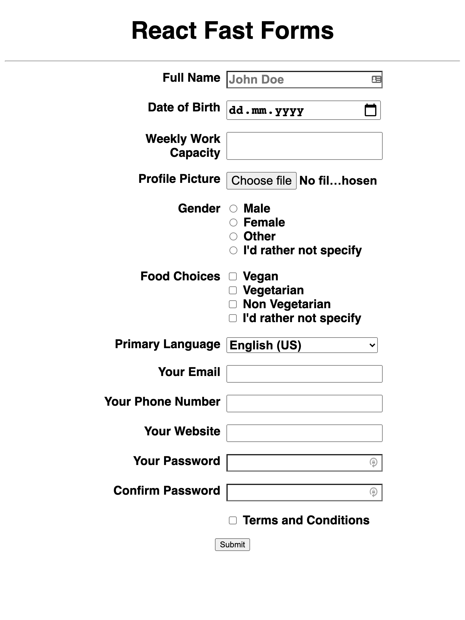
Which gives us the field in the HTML form as:

And with the validations of HTML5, it will trigger the errors until the Form is completely filled.
Though there are some validations which are still required. HTML5 validation with attributes can’t accomplish this.
For this, we will need custom validation via the HTML5’s Validation API
HTML5’s Validation API offers very elaborate properties and methods to tap into the HTML5’s validation features.
First to start with is the ValidationState interface. ValidationState Interface provides the boolean state with respect to the validation Attributes on Input elements. For example:
valueMissingis boolean answer ofrequiredtooLongformaxLengthtooShortforminLengthrangeOverflowformaxrangeUnderflowforminpatternMismatchforpatternstepMismatchfor the value to match or be divisible bysteptypeMismatchin case of value is not like the input type; only useful in case ofurlandemailvalidfor Input value to be valid and passes all the validation checkscustomErrorif any custom error has been set.
Another part is via very specific methods setCustomValidity and reportValidity. We will use these methods to report our custom validations.
For any input field,
setCustomValiditywill set the custom error on the input elementreportValiditywill make the validation error visible on the input elementcustomErroris set to true if error is set viasetCustomValidity
For above to take effect, let’s introduce some custom validations. We use one of the fields above, foodChoices:
  ...
  {
    type: 'checkbox',
    name: 'foodChoices',
    label: 'Food Choices',
    options: [
      ...
    ],
+    validations: [
+      (value, name, allFormValues, form) => ([
+        Boolean(allFormValues[name]),
+        `Please select atleast one of ${name}`
+      ]),
+      (value, name, allFormValues, form) => ([
+        ['V+', 'V', 'N', '-'].includes(value),
+        `Please select only from the provided choices for ${name}`
+      ])
+    ]
    },
  ...
We introduce a validations key which will accept an array of validators.
These validators will return the validity state and Error to show if not valid.
The arguments to these validators will follow the sequence of
- value of the field
- Name of the field
- All the values of the Form to compare and use
- Form itself to operate on a higher level, not needed most of the time
And with the above validations, we will need some Functions in Form component to handle the Form submit.
The Input component will also need the change as when we report the errors. Also, we need to run the checks immediately and clear the error once the field is valid.
Lets start by taking a look at the change in Checkbox renderer:
// src/components/InputType/Checkbox.js
import React, {Fragment, useRef, useEffect} from 'react'
import getId from '../../utils/get-id'

export default React.forwardRef(({registerField, ...props}, ref) => {
  const refs = useRef([])
  refs.current = (props.options || []).map(item => useRef(null))
  useEffect(() => {
    registerField(props.name, props.options ? refs : ref)
  }, [registerField, props.name, props.options])
  const id = getId()
  return (
    <Fragment>
      <label htmlFor={id}>{props.label}</label>
      {props.options ? (
        <span className="flex-col">
          {props.options.map((item, index) => {
            const id = getId()
            return (
              <span key={id}>
                <input id={id} {...props} value={item.value} ref={refs.current[index]} />
                <label htmlFor={id}>{item.label}</label>
              </span>
            )
          })}
        </span>
      ) : <input id={id} {...props} ref={ref} />}
    </Fragment>
  )
})
And the Input component which renders the Checkbox will change as follows:
// src/components/Input.js
// ...
// code above here is same as before for renderers
const Input = ({
  field = {},
  onChange = () => {},
  registerField = () => {},
}) => {
  const inputRef = useRef(null)
  const Component = getRenderer(field.type)
  return (
    <div className="form-field">
      <Component
        {...field}
        ref={inputRef}
        registerField={registerField}
        onChange={(...args) => onChange(field.name, ...args)}
      />
    </div>
  )
}
And now the Form component which will utilise the above changes to do manual validation:
export default function Form() {
  const form = useRef(null)
  const inputWithError = useRef(null)
  const fieldRefs = useRef({})

  const registerField = (key, ref) => {
    fieldRefs.current = {...fieldRefs.current, [key]: ref}
  }

  const getField = (key) => {
    return (
      Array.isArray(fieldRefs.current[key].current)
        ? fieldRefs.current[key].current[0]
        : fieldRefs.current[key]
    ).current
  }

  const resetError = (errorFieldKey) => {
    if (errorFieldKey) {
      const field = getField(errorFieldKey)
      if (!field) {
        return
      }
      field.setCustomValidity('');
      field.reportValidity();
    }
  }

  const handleChange = (key, ...args) => {
    resetError(inputWithError.current)
  }

  const customValidations = FIELDS.reduce(
    (acc, field) => field?.validations
      ? {...acc, [field.name]: field.validations}
      : acc
    , {}
  )

  const onSubmit = (e) => {
    e.preventDefault()
    if (inputWithError.current) {
      resetError(inputWithError.current)
    }

    if (!form.current.checkValidity()) {
      return false;
    }

    const formData = serialize(new FormData(form.current))

    let error = null
    // Check for custom validations
    const isValid = Object.keys(customValidations).reduce((acc, key) => {
      const validations = customValidations[key]
      const validity = validations.reduce((prevResult, validatorFn) => {
        // short circuit the validations if previous one has failed
        if (!prevResult) {
          return false
        }
        // previous one was valid, let's check for current validator and return the result
        const [valid, err] = validatorFn(formData[key], key, formData, form.current)
        if (!valid) {
          error = err
        }
        return valid
      }, true)

      acc[key] = validity;
      return acc;
    }, {})

    if (Object.keys(isValid).length) {
      const errField = Object.keys(isValid)[0]
      inputWithError.current = errField
      const field = getField(errField)
      if (!field) {
        return
      }
      field.setCustomValidity(error);
      field.reportValidity();
    }
  }

  return (
    <form className="form" ref={form} onSubmit={onSubmit}>
      {FIELDS.map((field) => (
        <Input
          key={field.name}
          field={field}
          registerField={registerField}
          onChange={handleChange}
        />
      ))}
      <button type='submit'>Submit</button>
    </form>
  )
}
A lot is going on in the above Form Component, let’s try to break it down by taking a look at each block of code
...
const form = useRef(null)
const inputWithError = useRef(null)
const fieldRefs = useRef({})
...
This block is creating refs to keep some information between renders of the Form. The most important one is the one named fieldRefs
This ref will collect all the refs of HTML5 Input elements like input, select, radio, checkbox etc.
And inputWithError will keep the lat field where the error was present
...
const registerField = (key, ref) => {
  fieldRefs.current = {...fieldRefs.current, [key]: ref}
}
...
This function above will be passed down to the renderers to register the input element to the fieldRefs collection.
...
const getField = (key) => {
  return (
    Array.isArray(fieldRefs.current[key].current)
      ? fieldRefs.current[key].current[0]
      : fieldRefs.current[key]
  ).current
}
...
Now this function named getField is gonna help us retrieve the Fields based on their names.
We need this function because we will need some logic while accessing the fields. That’s why it is better to keep the field access simplified in one place.
...
const resetError = (errorFieldKey) => {
  if (errorFieldKey) {
    const field = getField(errorFieldKey)
    if (!field) {
      return
    }
    field.setCustomValidity('');
    field.reportValidity();
  }
}
...
Now, this function will be handy to reset the error on any Field.
...
const handleChange = (key, ...args) => {
  resetError(inputWithError.current)
}
...
We will be passing this function down to the renderers to react to any change in the Fields. In the current use case, the only reaction we need is clear the errors if present.
...
const customValidations = FIELDS.reduce(
  (acc, field) => field?.validations
    ? {...acc, [field.name]: field.validations}
    : acc
  , {}
)
...
The above block will prepare aa subset of the collection to keep track of any needed custom validation to run. This collection will be handy in the submit method when we need to find the needed validations.
Next is our Form Submit Handler with signature:
...
const onSubmit = (e) => {
  e.preventDefault()
  ...
}
...
In this submit handler we perform some actions to make sure our Form Data is valid. Let’s take a look at the contents of the submit function.
...
const onSubmit = (e) => {
  e.preventDefault()
  if (inputWithError.current) {
    resetError(inputWithError.current)
  }

  if (!form.current.checkValidity()) {
    return false;
  }
  ...
}
...
There are two things in the above code block.
First is to clear the custom errors with inputWithError.current ref and resetError function.
Second is to check the validity of the Form with form ref and checkValidity function from HTML5 validation API
...
const formData = serialize(new FormData(form.current))

let error = null
...
Next, we prepare the Form Data as an object of form element names as keys and their values. We will do so with the help of FormData API and serialize function.
The serialize function looks like the following:
export default function serialize (formData) {
  const values = {};
  for (let [key, value] of formData.entries()) {
    if (values[key]) {
      if ( ! (values[key] instanceof Array) ) {
        values[key] = new Array(values[key]);
      }
      values[key].push(value);
    } else {
      values[key] = value;
    }
  }
  return values;
}
We had discussed the FormData in the following post. The serialize function above is also borrowed from the said post:

After serializing the data, we need to run the validations. The following Code Block in the Form Submit method will be doing so:
...
// Check for custom validations
const isValid = Object.keys(customValidations).reduce((acc, key) => {
  const validations = customValidations[key]
  const validity = validations.reduce((prevResult, validatorFn) => {
    // short circuit the validations if previous one has failed
    if (!prevResult) {
      return false
    }
    // previous one was valid, let's check for current validator and return the result
    const [valid, err] = validatorFn(formData[key], key, formData, form.current)
    if (!valid) {
      error = err
    }
    return valid
  }, true)

  acc[key] = validity;
  return acc;
}, {})
...
The above function works in fail-fast strategy. Any encounter of failed validation will make the whole Block result in invalid. And the failure will mark the field name and error message.
And then the last part of the Font submit function is:
...
if (Object.keys(isValid).length) {
  const errField = Object.keys(isValid)[0]
  inputWithError.current = errField
  const field = getField(errField)
  if (!field) {
    return
  }
  field.setCustomValidity(error);
  field.reportValidity();
}
Here if any error is preset after checking through the validator functions, we will set the custom Error. setCustomValidity for setting custom error and reportValidity to show it to the user
And that’s how we do the Simple and Fast forms in React by leveraging the Browser APIs.
Conclusion
The form will always be a pain if we try to do all things by ourselves. But Browser has pretty strong APIs to help you build the needed Form Validation.
We saw how to build customizable Forms and Do Custom Validations with HTML5.
What is or was your concern with Forms? Let’s try to fix it together.
Let me know through comments ? or on Twitter at @heypankaj_ and/or @time2hack
If you find this article helpful, please share it with others ?
Subscribe to the blog to receive new posts right to your inbox.
Credits
- Icons from IconFinder, [2], [3]


