
Get 3D effects with Shadows in CSS3
There are many ways to obtain the 3D effect. Here, we we will use shadows as we will have to increase only certain lines of code

You might have seen the 3D effect on Images and Videos. But have you noticed that the web has also evolved coming up with many possibilities.
Today we gonna discuss the ways to obtain 3D effect on webpages with shadows.
There are many ways to obtain the 3D effect. Here, we have selected shadows for this purpose because by using this we will have to increase only certain lines of code and rest is dependent of the Browser Capabilities.
If the Browser is capable of; why not to use that. So to obtain the 3D effect we will use two types of shadows.
Text Shadow
The text shadows will help us to obtain an appearance like the text is hard stuffed on background or the text is floating above the surface and light is creating shadow etc etc.
The basic syntax to obtain text shadow is
text-shadow :
	(R relative horizontal position)
	(R relative vertical position)
	(O blur radius)
	(O shadow color);
R: Required
O: Optional
Lets take a HTML element and apply shadow on it.
<span id="text_shadow">Time to Hack</span>
#text_shadow {
    padding : 10px;
    font-size : 18px;
    text-shadow : 2px 2px 2px #ccc;
    -webkit-text-shadow : 2px 2px 2px #ccc;
    -moz-text-shadow : 2px 2px 2px #ccc;
    -o-text-shadow : 2px 2px 2px #ccc;
    -ms-text-shadow : 2px 2px 2px #ccc;
}
And see with above CSS rules we got a text that will appear like it is 2px above the ground and light is dropping from the upper left corner.

Now we’ll see the CSS rules to obtain effect of stuffed text on background.
<span id="stuffed">Time to Hack</span>
#stuffed {
    padding : 10px;
    font-size : 18px;
    text-shadow : 0px 1px 0px #ccc;
    -webkit-text-shadow : 0px 1px 0px #ccc;
    -moz-text-shadow : 0px 1px 0px #ccc;
    -o-text-shadow: 0px 1px 0px #ccc;
    -ms-text-shadow : 0px 1px 0px #ccc;
}

Above two examples of text shadow you might have got the idea of working with shadows on text.
Box Shadow
The box shadow also works in the similar way but have some syntax differences due to requirements.
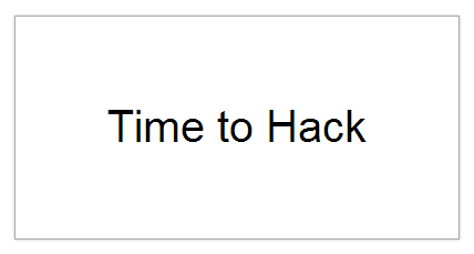
The box shadow when applied with correct positioning and z-index; you can obtain the appearance like the desktop windows.
So lets take a look at the example. First we have the markup.
<div class="box-one">Time to Hack</div>
Now we’ll see the styling rules.
.box-one {
    display : block ;
    width : 400px ;
    height : 200px ;
    line-height : 200px ;
    font-size : 40px;
    font-family : Arial, Helvetica, Verdana, Georgia;
    border : 1px solid #aaa;
    box-shadow : 0px 0px 4px #ccc ;
}
That was the markup style rules.
This 3D effect will show that a box is placed above ground and the light is being casted from the point above the centre of box.
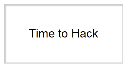
Similarly to obtain an appearance box fixed in background can be obtained by following style rules.
<div class="box-one">Time to Hack</div>
.fixed-box {
    display: block ;
    width: 400px ;
    height: 200px ;
    line-height: 200px ;
    font-size: 40px;
    font-family: Arial, Helvetica, Verdana, Georgia;
    border: 1px solid #aaa;
    box-shadow: 2px 2px 4px 4px #ccc inset;
}
In above box-shadow syntax the parameters were following this syntax
box-shadow:
    (R h-shadow)
    (R v-shadow)
    (O blur radius)
    (O spread)
    (O shadow color)
    (O inset);
R: Required
O: Optional
So now for the basics; you can play with this and obtain your own new experiences.
Share your experience and work using Box Shadow with me on @heypankaj_ and @time2hack