CSS Tutorial: Ripples Loading Animation like in Tinder ?
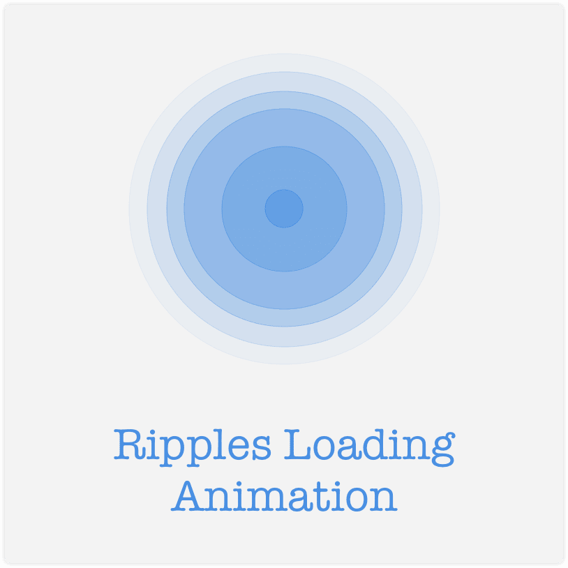
Loaders/Spinners, almost everyone of us have seen them. Ripples animation is a best way to show geolocation based searches. Lets see the tutorial for Ripples Loading animation like in Tinder.


Loaders/Spinners, almost everyone of us have seen them. Ripples animation is a best way to show geolocation based searches.
Lets try to create Ripples Loading animation like in Tinder.
The actual animation for one ripple is very simple:
- Create a circle
- Keep Increasing its radius
- And make it fade away while increasing radius
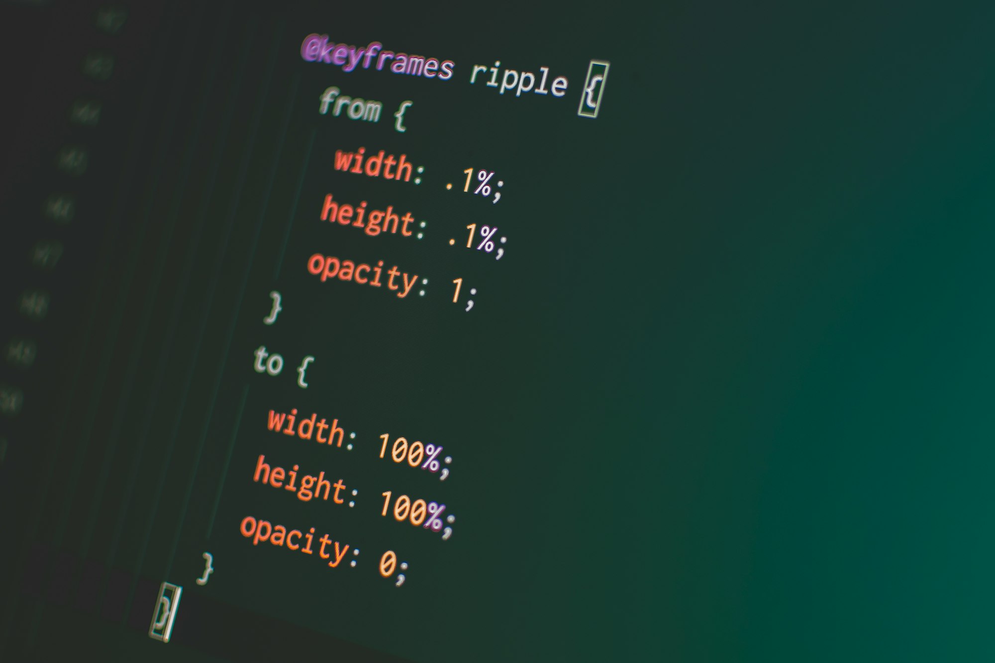
For one ripple, following @keyframes will make to look animated.
@keyframes ripple {
  from {
    width: 0.1%;
    height: 0.1%;
    opacity: 1;
  }
  to {
    width: 100%;
    height: 100%;
    opacity: 0;
  }
}
But what about the circle? Here is the CSS to create a decent circle:
.circle {
  width: 5rem;
  height: 5rem;
  display: block;
  border-radius: 50%;
  border: 2px solid #ccc;
  background: rgba(100, 100, 100, 0.1);
}
Now to make the ripples shown to be originating from same point, we need a container where will be positioning all the ripples and some specific elements absolute. For that, following CSS rules will go for .container
.container {
  width: 30rem;
  height: 30rem;
  margin: 0 auto;
  display: block;
  position: relative;
  /* cosmetics */
  border: 1px solid #eee;
  border-radius: 3px;
  box-shadow: 0 0 7px 0px rgba(100, 100, 100, 0.15);
}
Few parts are necessary, and few are just to make it look good.
and to make the ripple fit within the container, .circle will change to following:
.circle {
  top: 50%;
  left: 50%;
  width: 0;
  height: 0;
  display: block;
  border-radius: 50%;
  position: absolute;
  border: 2px solid #ccc;
  transform: translate(-50%, -50%);
  background: rgba(100, 100, 100, 0.1);
  animation: ripple 3s ease infinite;
}
That's the CSS part; following is the HTML part for above:
<div class="container">
  <a class="circle photo" href="//time2hack.com" target="_blank"></a>
  <div class="circle"></div>
</div>
That's it. This is our loading indicator which you have seen in the beginning of the post.
There's one more fancy thing we can do with this. We can add a click handler to add a ripple whenever we click on the container. Here is the JavaScript to that:
const container = document.querySelector('.container');

const ripple = function() {
  const el = document.createElement('div');
  el.classList.add('circle');
  container.appendChild(el);
  setTimeout(function() {
    container.removeChild(el);
  }, 2500);
}
container.addEventListener('click', ripple);
Demo:
Click inside the box:
Please let us know your feedback in comments ? and share ? with others if you find it interesting

