
CSS/CSS3 Flexbox Layout
A quick and basic guide to CSS3 Flexbox layout and the ways to achieve simplest layouts with Flexbox


Many times you have faced the problem or requirement of equal height divs which have unequal amount of content.
You require both divs to have the height of the parent container which should change on changing the height of either of the divs.
There have been some suggested tricky solutions to this problem like by having very large margin of divs and similarly that much large negative padding and then make the height auto to span it according to the content they have.
But this was solution to only one problem. What about other tricky problems that always needs tricky solutions.
CSS3 has pretty neat solution for this known as Flexbox. The Flexbox Model provides solutions to all the alignment problems of child elements in their parent container element.
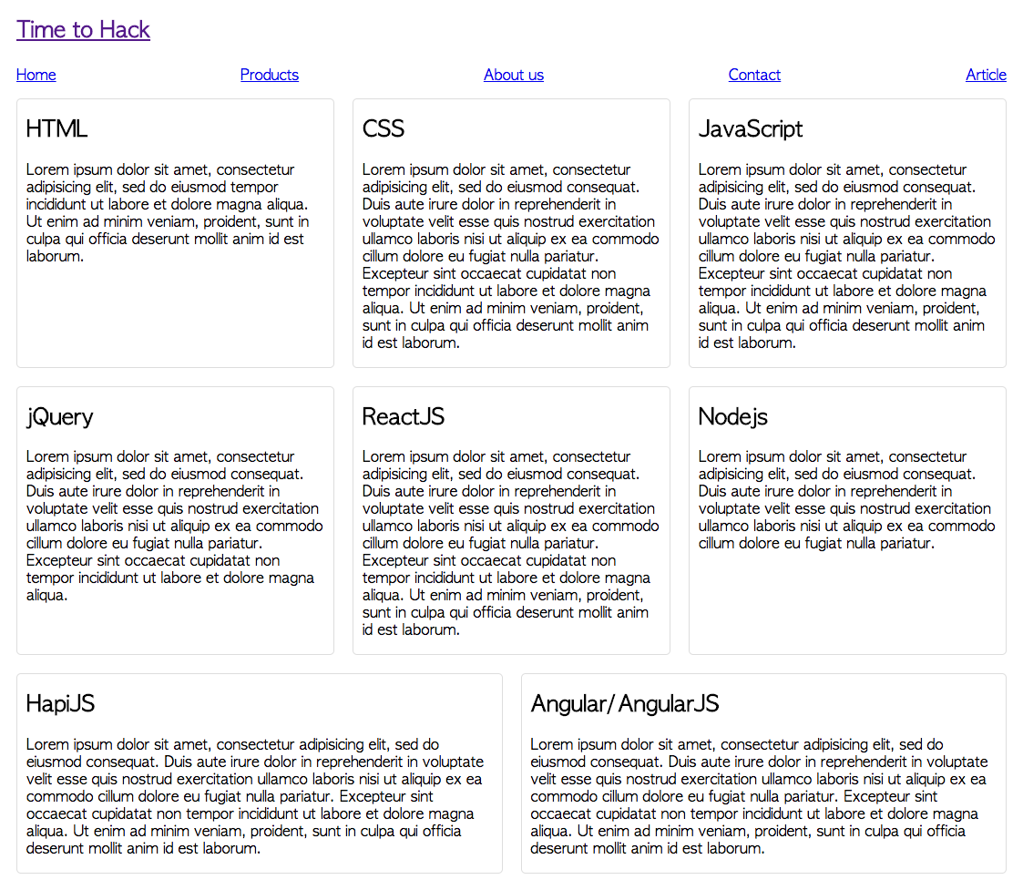
Here is example of what the CSS3’s Flexbox Module is capable of! Lets take a container div and this div contains an unordered list. Here we are willing to create a menu which spans on entire page and the menu’s inter item width depends on the number of items.
<ul class="menu">
    <li>Home</li>
    <li>Products</li>
    <li>About Us</li>
    <li>Contact Us</li>
</ul>
Now here is the style rules for above markup
.menu {
  /* basic ul styles to remove all spaces and bullets */
  list-style: none;
  margin: 0;
  padding: 0;

  /* Flexbox Styles, these will enable the Flexbox layout and direction of flow */
  display : flex;
  flex-direction: row;
  flex-wrap: wrap;

  /* folowing line will keep children jestified to cover whole width
      and trim the spaces on the outer edges of flex-direction */
  justify-content: space-between;
}

.menu li{
  padding: 5px 10px;
}
Lets see the how to add flexbox layout to elements step by step:
display: flexThis will add the flexbox layout to the container whose children are needed to be evenly spaced.flex-direction: rowNow we need to specify the direction in which the space has to be consumed.rowmeans consume space horizontally andcolumnmeans consume spaceverticallyflex-wrap: wrapThis will enable the children to be wrapped if they are overflowing the available space. This is needed when content will naturally need more space than available like container being200pxwide and the5children have texts needing more than approximately40pxi.e.(available space / total children).justify-content: space-betweenThis will justify the content; i.e. distribute the space in between the elements. Other good options can be following; there are more but we can refer them on MDN here.
space-aroundDistribute the empty space around the elements.space-evenlyDistribute the space evenly and don't bother about the content length.- ... etc.
Now lets see another example for the content. Let's take a wrapper section and it will have content in articles and see how it distributes with few rules.
<section>
  <article>
    <header><h2>HTML</h2></header>
    <p>...</p>
    <p>...</p>
  </article>
  <article>
    <header><h2>CSS</h2></header>
    <p>...</p>
  </article>
  <article>
    <header><h2>JavaScript</h2></header>
    <p>...</p>
  </article>
  <article>
    <header><h2>jQuery</h2></header>
    <p>...</p>
  </article>
  <article>
    <header><h2>ReactJS</h2></header>
    <p>...</p>
  </article>
  <article>
    <header><h2>Nodejs</h2></header>
    <p>...</p>
  </article>
  <article>
    <header><h2>HapiJS</h2></header>
    <p>...</p>
  </article>
  <article>
    <header><h2>Angular/AngularJS</h2></header>
    <p>...</p>
  </article>
</section>
And the styles are:
section {
  /* similar as ul wrapper */
  display: flex;
  flex-direction: row;
  flex-wrap: wrap;
}
article {
  /* priority in flex distribution
    and minimum to keep while distributing */
  flex: 1 320px;
  padding: 0 10px;
  border: 1px solid #ddd;
  border-radius: 5px;
  margin: 10px;
  transition: all ease 0.2s;
}
article:hover {
  box-shadow: 0 0 8px 0px rgba(100, 100, 100, .2);
}
One important rule to be paid attention to is flex: 1 320px;.
This will make the article tags of same priority, i.e. they will get even spaced and maintain the space at-least 320px for each of them.
This is how it looks for both menu and articles with flexbox layout:
You can see the demo here: https://demos.pankaj.pro/css-css3-flexbox-layout/
And for another layout, lets try with a sidebar to show few ads; it will look like following:
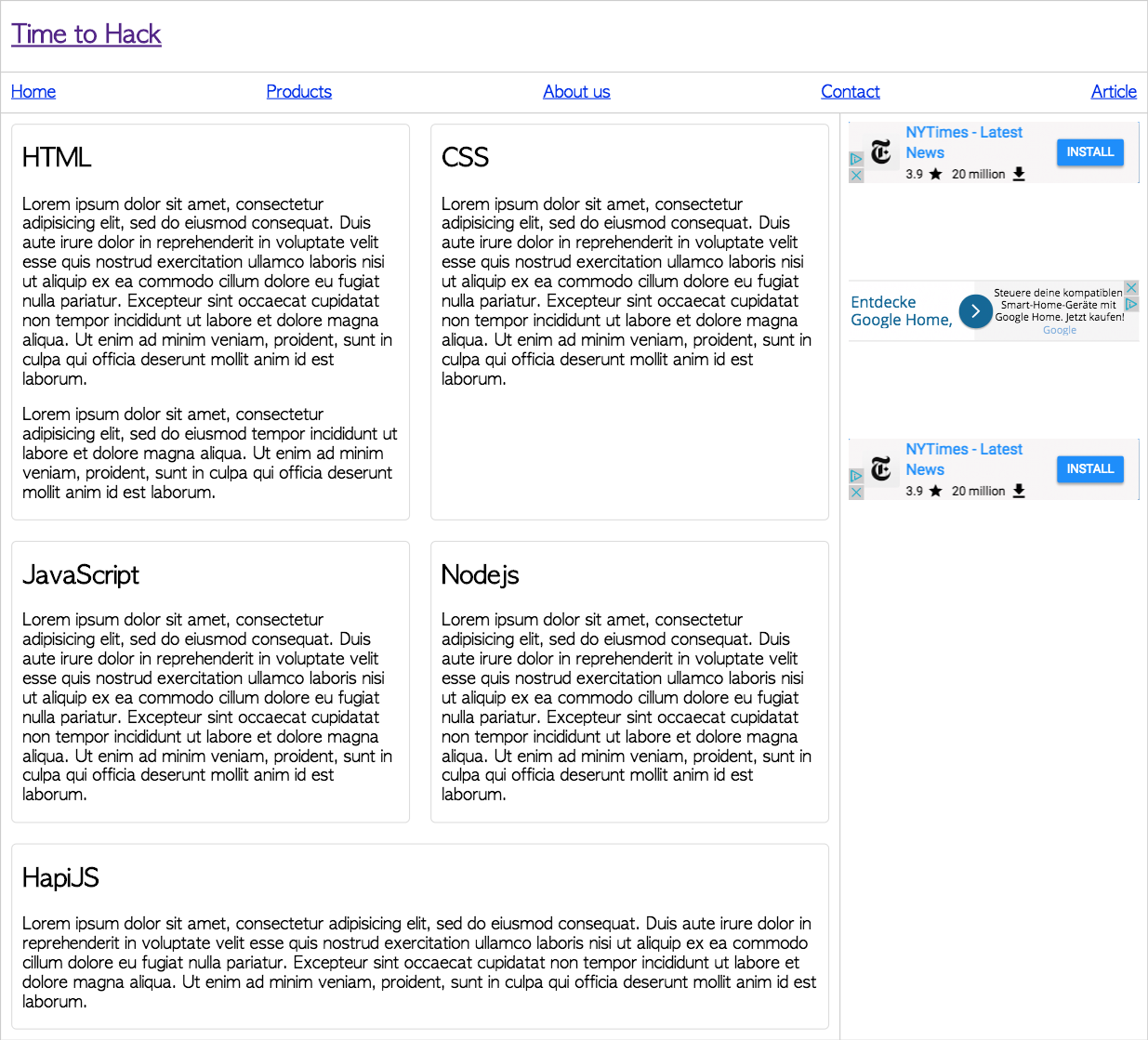
and you can see the above layout on your browser here: https://demos.pankaj.pro/css-css3-flexbox-layout/full-layout.html
Please let us know about your view, opinion and feedback about CSS Flexbox and this post in the comments section.