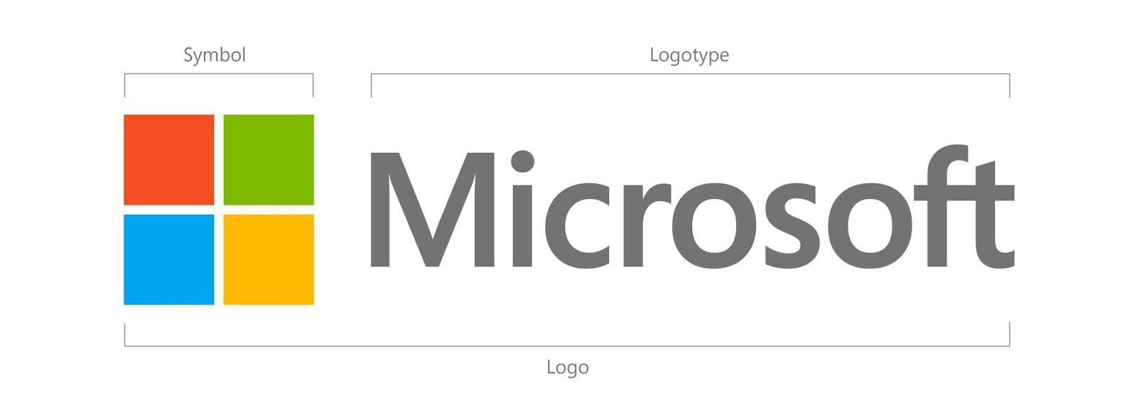
Microsoft gets new logo after 25 years

Microsoft will use a new logo for the first time in over two and a half decades. The software titan has created a new logo which has been heavily inspired by the emblem of Windows operating system.
This change in the logo also shows the company’s focus on the tile-centric Metro interface, which it uses in the Windows Phone platform, XBOX 360 and the upcoming Windows 8 and Office suite.
On the Microsoft Blog on TechNet, Jeff Hansen, the general manager of brand strategy at the company, said that this step will ensure that a consistent user experience can be delivered across all platforms, from PCs and phones to tablets and television.

Rather than the previous emblem, which only had the name of the company, this new logo has ‘Microsoft’ written in Segoe font on the right and square with four tiles, reminiscent of the Metro UI, on the left.
The new Microsoft logo is already on the company website and in retail stores in Boston, Seattle and Bellevue. It will be seen heavily in advertisements as well as intra-organisation communications.

