Basic site design with Bootstrap
With Bootsrap, you have easy grid & helper CSS to create your responsive websites & apps rapidly and easily. And the huge plugin ecosystem is big bonus


Hello friends. I am here with a framework guide to build a basic website. The framework we gonna discuss here is Bootstrap.
The benefit to use this framework is that you will get easy grid and helper css with which you can create your responsive site very easily.
So to start with Bootstrap, we have a basic structure for the framework which we have to follow to get it done.
First is to include the bootstrap files to the page.
Next is to decide a layout which you wanna develop for your website. Once the layout is final just have a rough picture of that (in terms of graphics); so that while developing you can refer to that.
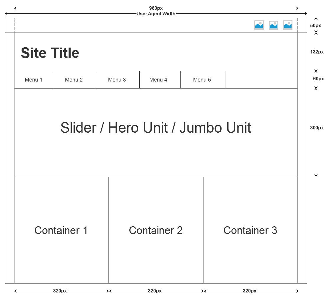
Now consider the following layout. We will start with headers and nav menu.

As in above layout we are considering fixed width not the full width. So for this bootstrap provides a helper class .container which will provide fixed width under different resolutions ranging from desktop-notebooks-tablets-mobiles. This class can be used as a container class and nested elements can distribute only on a fixed width.
<!DOCTYPE html>
<html>
<head>
	<title>Bootstrap</title>
	<link rel="stylesheet" type="text/css" href="css/bootstrap.min.css">
	<link rel="stylesheet" type="text/css" href="css/bootstrap-theme.min.css">
	<link rel="stylesheet" type="text/css" href="css/font-awesome.min.css">
</head>
<body>

<!-- Script Includes -->
<script type="text/javascript" src="js/jquery-1.10.2.min.js"></script>
<script type="text/javascript" src="js/bootstrap.min.js"></script>
</body>
</html>
For header bootstrap provides the header class. In header we can use the typography guide to achieve the site title, site sub title and other required sections.
We have a top bar to include some images; those images will serve as the social connections. Now for social icons I have used the font-awesome.
<nav class="navbar navbar-default">
<div class="container">
    <ul class="nav navbar-nav navbar-right">
      <li><a href="#" class="fa fa-twitter fa-2x"></a></li>
      <li><a href="#" class="fa fa-facebook fa-2x"></a></li>
      <li><a href="#" class="fa fa-linkedin fa-2x"></a></li>
      <li><a href="#" class="fa fa-google-plus fa-2x"></a></li>
    </ul>
</div>
</nav>
Now for site’s main section we will have .container class and inside that we will design our page.
And for navigation also there is some structure and some classes. You can use nav-default for normal menu of white and gray shade, .nav-inverse for inverted colour scheme of nav-default. So according to layout we are using here nav-default.
<div class="header">
	<h1 class="text-info">Time to Hack</h1>
	<nav class="navbar navbar-default" role="navigation">
	    <ul class="nav navbar-nav">
	      <li class="active"><a href="#">Home</a></li>
	      <li><a href="#">Services</a></li>
	      <li><a href="#">Blog</a></li>
	      <li><a href="#">About Us</a></li>
	      <li><a href="#">Contact Us</a></li>
	    </ul>
	</nav>
</div>
As you can see in the layout; we have a jumbotron(previously termed as hero unit in previous versions of bootstrap) and three information columns.
So now for the jumbotron you can use the .jumbotron class for the div element. Now inside that div you can create some of the h1…h6 and p to create an interactive entry text for the site. On the screen re-size or the mobile screens; it will automatically adapt. Following is the HTML for the jumbotron.
<div class="jumbotron">
  <h1 class="text-success">Products</h1>
  <p>Lorem ipsum dolor sit amet, consectetur adipisicing elit, sed do eiusmod
	tempor incididunt ut labore et dolore magna aliqua. Ut enim ad minim veniam</p>
</div>
Now in place of the jumbotron you can place a carousal. For carousal you can put the following html code. This code has been sampled from the official bootstrap examples.
<!-- Carousel
================================================== -->
<div id="myCarousel" class="carousel slide" data-ride="carousel">
  <!-- Indicators -->
  <ol class="carousel-indicators">
    <li data-target="#myCarousel" data-slide-to="0" class="active"></li>
    <li data-target="#myCarousel" data-slide-to="1"></li>
    <li data-target="#myCarousel" data-slide-to="2"></li>
  </ol>
  <div class="carousel-inner">
    <div class="item active">
      <img data-src="holder.js/900x500/auto/#777:#7a7a7a/text:First slide" alt="First slide">
      <div class="container">
        <div class="carousel-caption">
          <h1>Example headline.</h1>
          <p>Note: If you're viewing this page via a <code>file://</code> URL, the "next" and "previous" Glyphicon buttons on the left and right might not load/display properly due to web browser security rules.</p>
          <p><a class="btn btn-lg btn-primary" href="#" role="button">Sign up today</a></p>
        </div>
      </div>
    </div>
    <div class="item">
      <img data-src="holder.js/900x500/auto/#666:#6a6a6a/text:Second slide" alt="Second slide">
      <div class="container">
        <div class="carousel-caption">
          <h1>Another example headline.</h1>
          <p>Cras justo odio, dapibus ac facilisis in, egestas eget quam. Donec id elit non mi porta gravida at eget metus. Nullam id dolor id nibh ultricies vehicula ut id elit.</p>
          <p><a class="btn btn-lg btn-primary" href="#" role="button">Learn more</a></p>
        </div>
      </div>
    </div>
    <div class="item">
      <img data-src="holder.js/900x500/auto/#555:#5a5a5a/text:Third slide" alt="Third slide">
      <div class="container">
        <div class="carousel-caption">
          <h1>One more for good measure.</h1>
          <p>Cras justo odio, dapibus ac facilisis in, egestas eget quam. Donec id elit non mi porta gravida at eget metus. Nullam id dolor id nibh ultricies vehicula ut id elit.</p>
          <p><a class="btn btn-lg btn-primary" href="#" role="button">Browse gallery</a></p>
        </div>
      </div>
    </div>
  </div>
  <a class="left carousel-control" href="#myCarousel" data-slide="prev"><span class="glyphicon glyphicon-chevron-left"></span></a>
  <a class="right carousel-control" href="#myCarousel" data-slide="next"><span class="glyphicon glyphicon-chevron-right"></span></a>
</div><!-- /.carousel -->
Now as the jumbotron is ready; we will now create the three columns. And the columns will have some highlighting text about any product or any service.
For the column creation; bootstrap provides the easy classes with which you can decide how the columns should behave when opened in different resolutions. We will have a container div with the class .row.
Now the container element will be divided into columns. Bootstrap provides a 12 column grid to facilitate the RWD. Here, we are willing to make three columns so each of ours column will be 4 columns of grid.
Now more interesting part with this grid system is that this grid system is still categorized into 4 different screen resolution sets i.e. Extra small devices, Small devices, Medium devices, Large devices. Following table shows the associated classes and behaviors on these sets.
| Extra small devicesPhones (<768px) | Small devices Tablets (≥768px) | Medium devicesDesktops (≥992px) | Large devices Desktops (≥1200px) | |
|---|---|---|---|---|
| Grid behavior | Horizontal at all times | Collapsed to start, horizontal above breakpoints | ||
| Max container width | None (auto) | 750px | 970px | 1170px |
| Class prefix | `.col-xs-` | `.col-sm-` | `.col-md-` | `.col-lg-` |
| # of columns | 12 | |||
| Max column width | Auto | 60px | 78px | 95px |
| Gutter width | 30px (15px on each side of a column) | |||
| Nestable | Yes | |||
| Offsets | Yes | |||
| Column ordering | Yes | |||
So each of our column will have the class set of .col-xs-12 .col-sm-4 .col-md-4 .col-lg-4.
Here it will look like
<div class="row">
  <div class="col-xs-12 col-sm-4 col-md-4 col-lg-4">
    <p>Some Content</p>

    <button class="btn btn-primary">Read More</button>
  </div>
  <div class="col-xs-12 col-sm-4 col-md-4 col-lg-4">
    <p>Some Content</p>

    <button class="btn btn-primary">Read More</button>
  </div>
  <div class="col-xs-12 col-sm-4 col-md-4 col-lg-4">
    <p>Some Content</p>

    <button class="btn btn-primary">Read More</button>
  </div>
</div>
And now see our basic web page is complete according to our layout with the Bootstrap.
Demo Download
